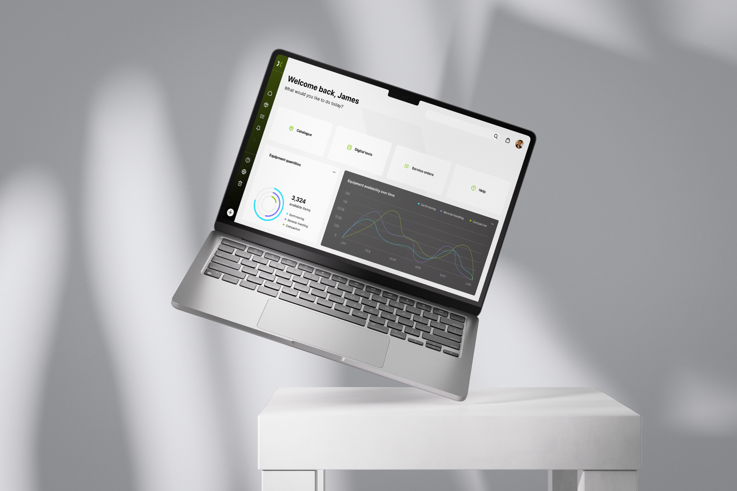
UX review and redesign:
Axis Construction
A full UX review of a dashboard aimed at builders and construction workers to manage and requisition construction equipment

The problem
The existing dashboard for managing construction equipment inventories and orders was outdated, cluttered, and difficult to navigate. Users struggled with inefficient workflows when cataloguing equipment, placing requisition requests, and tracking orders. The overall design lacked modern usability standards, which led to frustration, slowed processes, and an increased risk of user errors.
The solution
I conducted a comprehensive user experience (UX) audit of the dashboard, identifying key usability issues and gathering feedback from users. My audit report highlighted significant failings in the system’s interface and functionality. Based on these insights, I proposed and implemented several improvements, including:
A complete redesign of the dashboard, focusing on a clean, intuitive layout that streamlined workflows
A modernised, user-friendly interface with better visual hierarchy, making it easier for users to access important features
A responsive mobile version of the dashboard, ensuring users could manage equipment catalogues and orders efficiently on any device
User personas and empathy maps were created to identify and get to know the different user groups


