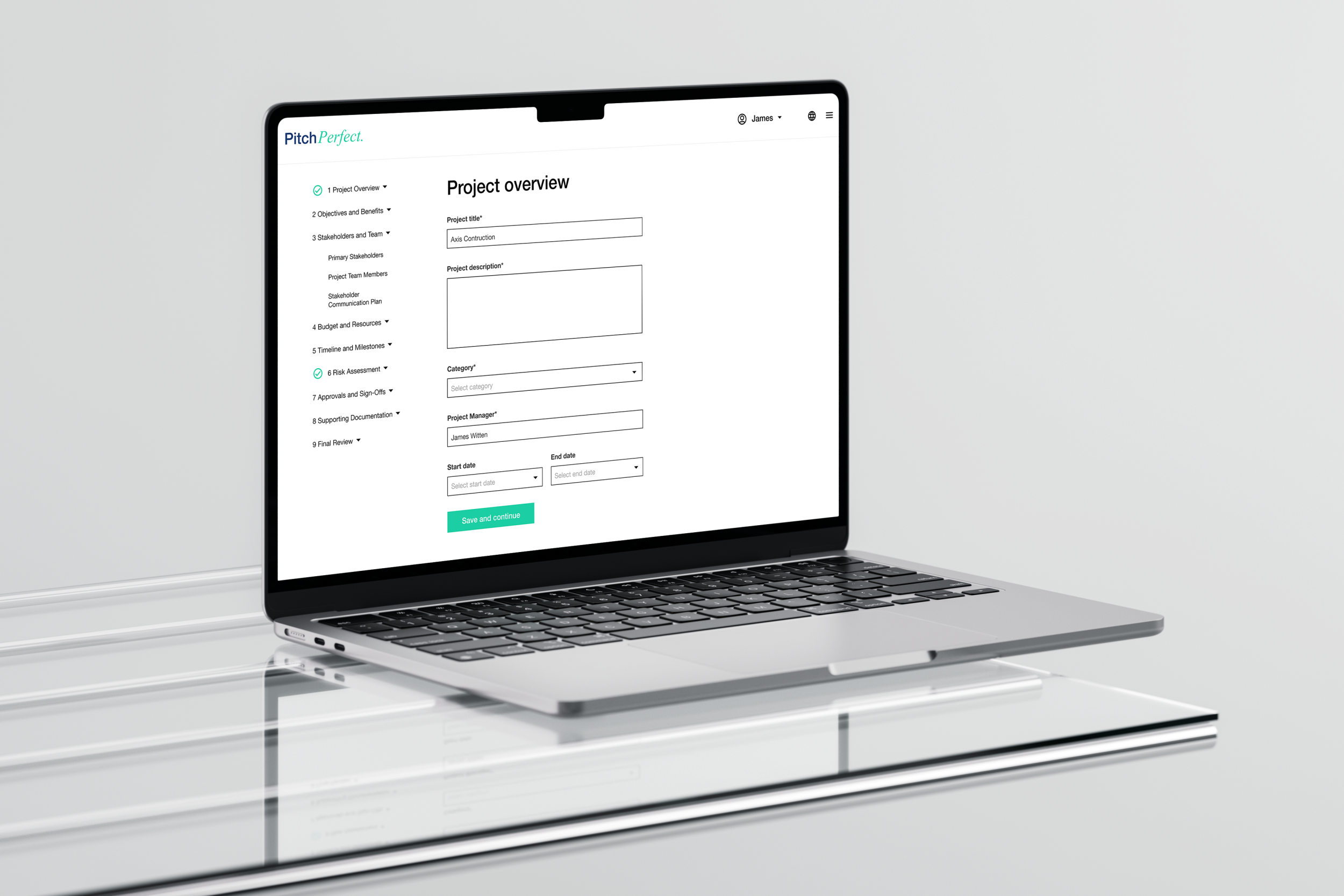
UX review: PitchPerfect
A full UX audit of an existing project pitch creation form, with user research interviews and responsive redesign
The problem
A Project Proposal Form was developed to streamline the submission of new project ideas, but it was created without input from a UX designer. The result was a tool that was difficult to navigate, with users often getting confused by the complex structure and unclear instructions. As a result, many users abandoned the form halfway through, leading to incomplete submissions and frustration. The system lacked a simple way for users or managers to track the progress or status of submitted proposals, creating inefficiencies in the review process.
The solution
I conducted a UX audit to uncover the issues with the existing Project Proposal Form. Through user research, including interviews with form users, I identified several key pain points: confusing question structure, a lack of clarity about required fields, and the absence of any progress tracking.
Based on this feedback, I redesigned the form with a focus on simplicity and clarity. The form was divided into logical sections, with each step accompanied by clear instructions on what information was required. I introduced visual cues, such as progress bars, to give users feedback on how much of the form they had completed. The overall design was modernised with a clean, user-friendly interface that prioritised readability and ease of navigation.
The results
Users successfully completed the form, resulting in fewer abandoned submissions.
Clearer instructions and a better structure improved user understanding of what was required at each step.
The inclusion of a progress bar allowed users to track their progress, reducing frustration and uncertainty.
Administrators could now easily monitor the status of proposals, improving oversight and speeding up the review process.
Overall user satisfaction increased due to the improved ease of use and streamlined process.


